 Accessible Layout
They say that looks matter – in the case of document design, this is true. The twist is that the document needs to look good – even for those who can’t “see” it. Thoughtful design of your page layout helps everyone and, for some students, can be the difference between success and failure. For example:
- Students using text to speech software can be confused if information on the page is out of order – this is particularly an issue for Google or PowerPoint Slides (or PDFs made from them).
- Students with some learning disabilities struggle with long, wordy paragraphs or “walls of text”.
- Students who are blind, have low vision or with some cognitive disabilities are hampered if your layout or navigation is inconsistent or overly complex.
- Font, spacing, and justification choices can affect a student with reading disabilities (such as dyslexia), making it difficult to read and understand your material.
- Small clickable areas or links can be difficult for students with motor impairments to target and click.
- New students and those who are not confident with computers may become frustrated with unpredictable and inconsistent layouts.
- Students with children or working in areas with distractions benefit from things that help remove cognitive load such as consistency, intuitive navigation and clear writing.
Things to keep in mind
- Consistency is key – knowing where to look and what to expect from a document or course layout helps all students.
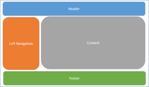
- Navigation should be intuitive and easy to learn. A student should be able to go to a new page or course and already know how to move through and around it.
- Language should be consistent – for example; if you were talking about your computer monitor, always refer to it as your monitor – not monitor or display or desktop or flatscreen or magic window etc…
- Boilerplate information that appears on multiple documents (such as contact information or links to the helpdesk) should be found on the same place across all documents.
- Interactive and navigation elements should be easy to identify and predictable
- The reading order on a Slide or PowerPoint will, by default, be the order that you added the element or text box to the slide. Use the reading order tools to ensure that assistive technologies read the slide contents in the correct order.
- Avoid full justification of text – it forces uneven spaces between words which can form rivers of white, making it distracting and difficult to read. To follow best practice, left justify all text.
- Use the tools built into your word processing program to create columns – never use tabs, spaces or tables to create text columns. Screen readers read straight across and improperly created columns will cause serious confusion.
- Choose simple, easy to read fonts. Specialty, cursive and ornate fonts can be difficult to read for many users – including those with low vision, cognitive disabilities, and dyslexia.
- Minimum font size for reading materials is 11 or 12 point depending on font choice
- Minimum font size for slides (such as PowerPoint) is 24 point
- Line spacing can make text easier to read and track – especially for students with reading disabilities and low vision.
- Line spacing between lines should be 1.15 -1.5
- Line spacing between paragraphs should be 2
- Use the tools available in your word processing program to set spacing between paragraphs – don’t add an extra return (enter) to separate paragraphs – this can be problematic for screen readers and can look very different on different machines.
- Avoid ‘walls of text”. Short, clean paragraphs are easier to read for everyone. The following are guidelines are best practice for optimal paragraphs:
- Line length: between 60 and 100 characters per line
- Sentence length: 20 words (or less) per sentence
- Paragraph length: 5 sentences (or less) per paragraph
- If you use interactive elements or clickable links, make sure that they are easy to identify as a link and large enough for users with limited or unsteady motor skills to be able to click on (and have the appropriate alt-text for any graphic links).
- Be strategic with your online course layout – use folders and sub-folders prudently. Too many layers can confuse students and important materials can be easily missed by users – especially those using assistive technologies. Conversely, too few layers can be overwhelming and important information can get lost in the crowd.
Tips and Tricks
- Too many fonts on a page make the document look messy and can be distracting. Limit your font choices to 2 or 3 for any document.
- There is some debate on whether serif or sans serif fonts are better for optimal reading, but fonts such as Verdana, Tahoma, and Georgia were designed for reading on a computer screen and are generally the best choices for readability and usability.
- When planning your course, create a diagram or flowchart to help you determine the best layout to create consistent and intuitive navigation across your materials. Ensure that all of your materials fit logically into your plan and that information is not buried under too many layers before you start uploading your content.
Guides
Reading Order
The reading order on a Slide or PowerPoint will, by default, be the order that you added the element or text box to the slide. Use the reading order tools to ensure that assistive technologies read the slide contents in the correct order.
Checking and Changing the Reading Order in PowerPoint
Checking Reading Order in Grackle
From Microsoft: Make your PowerPoint presentations accessible to people with disabilities
